Introduction
Mobile visitors now dominate web traffic for many sites, and shoutboxes that feel clunky on small screens lose conversation momentum fast. Designing mobile-first layouts and micro-interactions tuned to quick reading, fast replies, and low-friction participation can dramatically increase reply rates. This guide covers proven layout patterns, interaction details, and practical tips you can apply to your shoutbox today.
Principles of Mobile-First Shoutbox Design
Start with mobile constraints and optimize for the most common mobile behaviors: short attention spans, one-thumb operation, and intermittent connectivity. Focus on:
- Clarity—prioritize readable text, contrast, and touch targets.
- Speed—minimize animations that feel slow; keep responses immediate.
- Progressive enhancement—add richer interactions for larger screens but ensure core functionality works on basic mobile browsers.
These principles guide decisions from how many messages show by default to whether avatars appear inline. For accessibility and inclusivity considerations, align choices with best practices so every visitor can participate; see our article on Accessibility & Inclusivity: Make Your Shoutbox Work for Everyone for deeper guidance.
Mobile Layout Patterns That Encourage Replies
Layouts drive behavior. Below are patterns grouped by intent: minimize friction, encourage follow-ups, or highlight calls to action.
1. Compact Feed + Persistent Composer
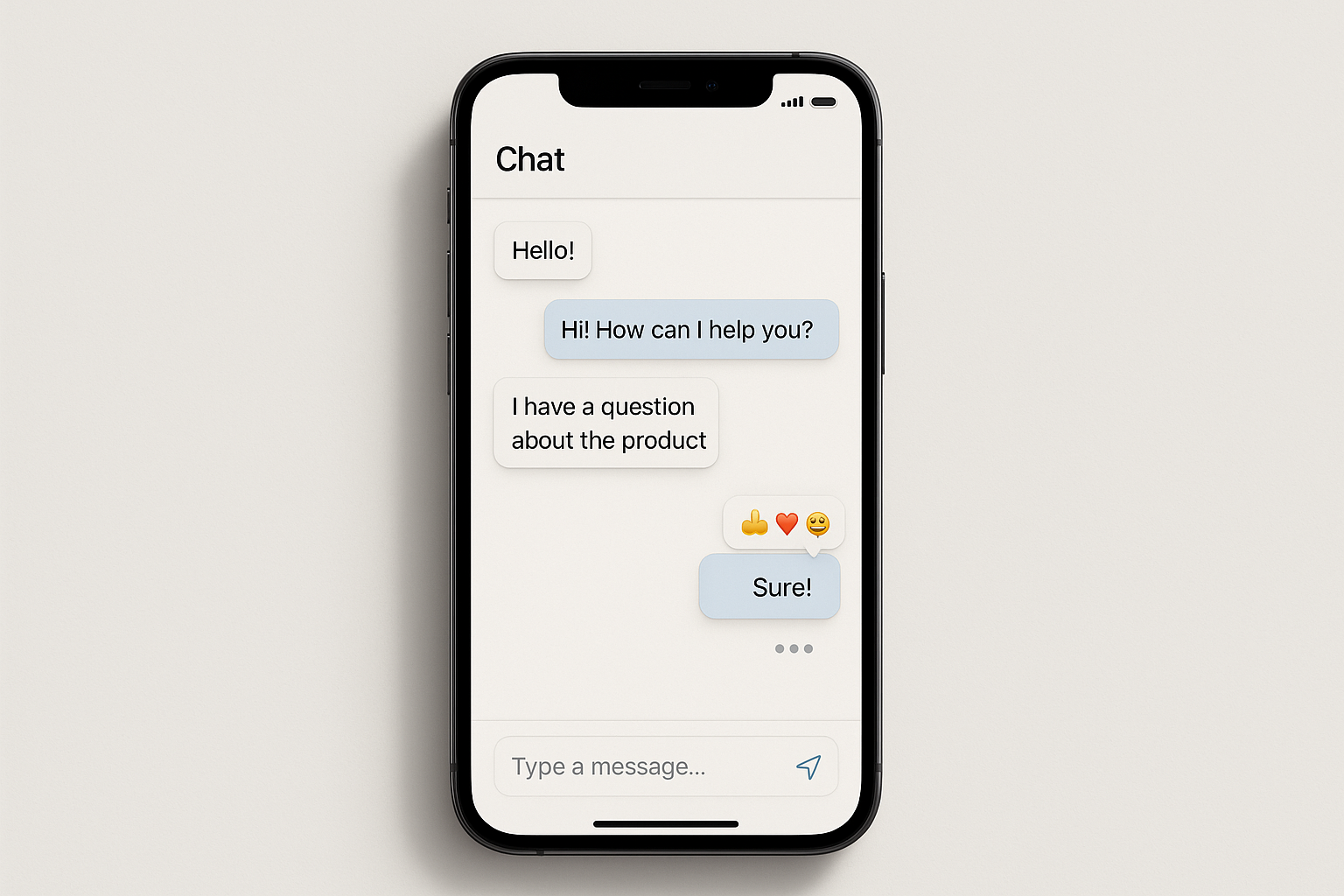
Description: A compact message feed occupies the top 60–70% of the widget, with a persistent composer docked at the bottom. The composer is always visible so users can reply without scrolling.
- Practical tips: Keep the composer to one line with a clear placeholder like “Reply or ask a question…” and expand to multiple lines when focused. Use a single prominent send button sized at least 44px for touch targets.
- Why it increases replies: Users rarely need to scroll away from the input; the low-friction composer invites one-line responses and quick reactions.
2. Threaded Peek with Quick Reply Buttons
Description: Show a flat feed but enable a threaded peek when a message is tapped—expand the message inline and show a compact quick-reply row with suggested replies or reaction buttons.
- Practical tips: When a message expands, reveal 2–3 suggested reply chips (e.g., “Agree”, “How so?”, “Nice tip”) and a reply icon. Chips should be horizontally scrollable to save vertical space.
- Why it increases replies: Suggested replies reduce cognitive load and give users a quick path to respond in one tap.
3. Condensed Thread Mode for High-Volume Rooms
Description: For busy shoutboxes, use a condensed mode where each message shows name, avatar, and a 1–2 line snippet. Tapping opens the thread. This reduces noise and lets users find meaningful messages to reply to.
- Practical tips: Prioritize showing replies count and last activity timestamp to signal conversation viability. Add a subtle “Tap to open thread” affordance.
- Why it increases replies: Less overwhelm means higher quality participation—users reply when they find contextually relevant messages.
Micro-Interactions That Drive Reply Behavior
Tiny, well-timed animations and feedback signals are powerful on mobile. Below are micro-interactions that encourage more replies by signaling activity, reducing uncertainty, and making tapping feel rewarding.
Typing Indicators and Presence Signals
Show when someone else is typing or when multiple people are viewing the thread. Subtle text like “2 people typing…” or a small animated ellipsis gives users confidence that a conversation is live and worth joining.
- Implementation tip: Use a lightweight presence system—update indicators at low frequency (e.g., once per second) to save battery and bandwidth.
- Behavioral effect: Typing indicators reduce the fear of talking to an empty room and often prompt quick replies.
Send Confirmation & Micro-Animations
Replace stale page refreshes with instant, micro-feedback: animate the message into the feed on send, briefly highlight the new message, and show a send success tick. Keep animations subtle (200–300ms) to feel snappy.
- Practical tip: For interrupted connections, show a muted “sending…” state and allow users to retry inline.
- Why it increases replies: Immediate feedback reassures users that their contribution was posted, lowering friction for follow-up messages.
Reply Suggestions and Smart Reply Chips
Generate context-aware suggested replies using simple heuristics (e.g., if a question mark appears, suggest “Answer: …” or “I agree”). Present these as chips above the composer for one-tap insertion.
- Implementation tip: Start with static heuristics and a small curated list before adding AI-driven suggestions. Keep suggestions short and conversational.
- Why it increases replies: One-tap inserts turn thought-to-action into a single interaction, ideal for mobile users who prefer minimal typing.
Reaction Shortcuts and Long-Press Popovers
Let users react with emojis or simple reactions via long-press on a message or a quick tap on a reaction button. Animating the reaction into place (pop + fade) provides a satisfying moment that encourages repeat engagement.
- Practical tip: Provide an accessible fallback for assistive tech (e.g., labeled buttons) and keep reaction options limited on mobile to avoid choice paralysis.
- Why it increases replies: Quick reactions are lower effort than composing messages and often convert reactive users into commenters over time.
Behavioral Design: Nudges That Work on Mobile
Beyond layout and micro-interactions, subtle behavioral nudges increase the probability of replies. Use scarcity, social proof, and timely prompts carefully.
Recent Activity Highlights
Show a small banner like “3 new messages since your last visit” or highlight a trending thread. This primes users to enter the conversation and respond.
Conversational Onboarding for New Users
For first-time participants, a short guided flow increases comfort and reply rates. Use a conversational onboarding approach that asks for a display name and suggests a first message to send.
See our guide on Designing a Conversational Onboarding Flow in Your Shoutbox for concrete flows and examples you can implement.
Micro-Goals and Soft Gamification
Consider soft rewards—badges, streak indicators, or visible reply counts—that encourage replies without turning your shoutbox into a points-first system. Keep rewards lightweight and community-focused.
Performance, Accessibility, and Implementation Tips
Mobile-first design must also be fast and accessible. Below are practical considerations to implement the above patterns effectively.
Optimize for Speed and Low Bandwidth
- Use client-side rendering and incremental updates (WebSockets or server-sent events) to avoid full refreshes.
- Lazy-load avatars and media; fallback to initials until assets load.
- Compress payloads and debounce frequent events like typing indicators to save battery and data.
If you run your site as a single-page application, see our technical tips on Embedding a Shoutbox in React/Vue SPAs: Performance & SEO to balance performance and discoverability.
Accessibility Considerations
- Ensure all interactive elements have accessible names (aria-labels) and large enough touch targets.
- Support screen readers by using live regions for new messages and proper focus management when threads open.
- Provide text-based alternatives for reaction animations and do not rely solely on color to communicate status.
Following accessibility best practices not only broadens your audience, but also improves usability for everyone; read our detailed accessibility guidance in Accessibility & Inclusivity: Make Your Shoutbox Work for Everyone.
Moderation & Safety on Mobile
Design moderation workflows that work on small screens: quick flagging, inline hide/report actions, and compact moderator toolbars. Teach moderators to use one-thumb gestures for speed and efficiency.
For practical moderation strategies and tool recommendations, our Moderator’s toolkit: AI filters, custom wordlists & human review article outlines systems you can adopt to keep conversations healthy without creating friction for legitimate replies.
Measuring What Matters: KPIs to Track Reply Growth
To evaluate changes, track metrics that connect design changes to behavior. Useful KPIs include reply rate (replies per unique visitor), thread depth, time-to-first-reply, and return visits driven by shoutbox interaction.
Our breakdown of the most valuable metrics in Measuring Impact: 7 KPIs to Track Your Shoutbox’s Effectiveness can help you set up tests and interpret results.
Case Examples and Practical Recipes
Below are two concise recipes you can implement and A/B test on mobile.
Recipe A — Quick-Reply Focused
- Layout: Compact feed + persistent one-line composer.
- Micro-interactions: Quick-reply chips appear when a message is tapped; one-tap send animates the chip into the composer.
- Behavioral nudge: Show “1–2 suggested replies” banner on thread open.
- Expected outcome: Higher reply rate but shorter message length.
Recipe B — Threaded Depth
- Layout: Condensed feed with threaded peek; show replies count prominently.
- Micro-interactions: Typing indicators in threads and inline reaction long-press.
- Behavioral nudge: Highlight active threads with a subtle color accent.
- Expected outcome: Fewer but more meaningful replies and longer thread depth.
Bringing It All Together
Mobile-first shoutbox design is a blend of layout, micro-interaction, and behavioral nudges. Start small: ship a persistent composer, add one quick-reply micro-interaction, and instrument the experience with metrics. Iterate based on data and user feedback—link your changes to KPIs like reply rate and time-to-first-reply.
If you want inspiration for niche applications and how a shoutbox can grow engagement in specific contexts, check our Niche deep dive: Grow engagement on hobbyist blogs with a shoutbox entry for real-world examples.
Conclusion & Call to Action
Designing for mobile-first engagement requires intentional layout choices, crisp micro-interactions, and measurement to learn what actually increases replies. Implement one pattern at a time, measure its impact, and iterate. Ready to improve reply rates on your site? Try one of the recipes above, instrument reply metrics, and refine from there. For implementation help or to embed a shoutbox quickly, visit our Homepage to get started.